The Problem: From Information Overload to ‘Stuck Synthesis’
As an Interaction Design and IT student, my design philosophy stems from my own frustrating experiences with university research. I was good at collecting information—ending up with dozens of tabs and PDFs—but felt paralyzed when trying to make sense of it all into a coherent argument. Existing tools felt like “digital filing cabinets” that only stored information but didn’t help me think.
The Solution: A Visual Workspace for Thinking
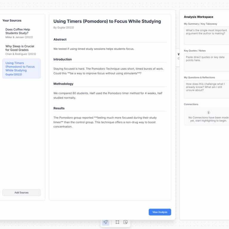
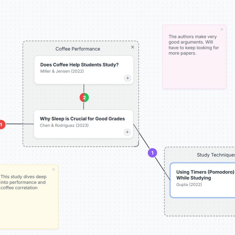
Thinking Space is an interactive web application that bridges the gap between research collection and argument building. It’s a ‘cognitive gym,’ not an ‘answer machine.’ Grounded in HCI principles like External Cognition and Cognitive Load Theory as well as proven study methods like the SQ3R, the app provides a visual, spatial canvas to help users offload their complex thoughts and focus on synthesis.
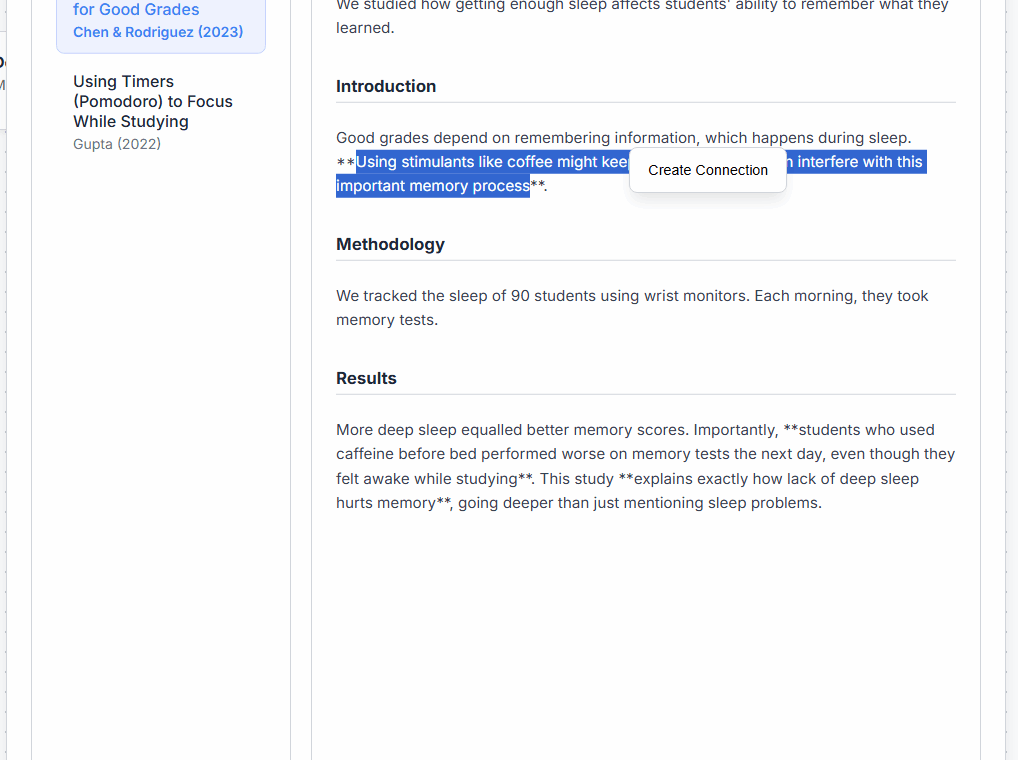
Feature 2: Granular Sentence-to-Sentence Connections
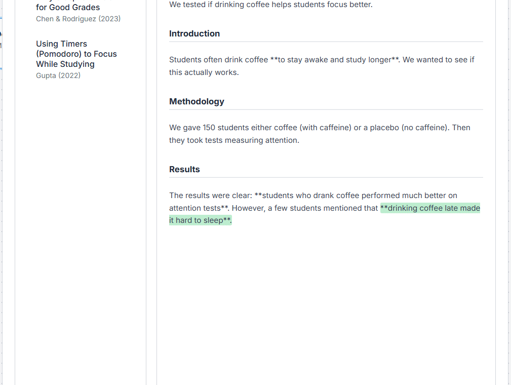
The app’s core feature allows users to create granular, sentence-to-sentence links between documents. Users can highlight a specific sentence, initiate a connection, and link it to a corresponding sentence in another paper. This allows for a level of nuance far beyond simple document linking.
My Process: From Paper to a Coded Prototype
This project evolved through an iterative design process, starting with user research and low-fidelity paper prototypes. Feedback from this testing directly informed the medium-fidelity Figma prototype, which was then translated into a high-fidelity, interactive web application using HTML, CSS, and JavaScript. Every feature was validated against multiple user feedback.
I want this app to be easy and straightforward. My personal experience in uni showed me that the hardest part of research isn’t finding information, it’s synthesizing it. I’m driven to create the tools I wish I had.
Lyle Matthew Castillo


